
The Psychology of Colour: How Canvas Prints Shape Mood and Memory in Canadian Homes
Colour is more than just a visual experience—it's a powerful tool that can influence our emotions, behaviours, and even our memories. In Canadian homes, where long winters and short daylight hours can affect mood, the colours we surround ourselves with become even more significant. Canvas prints offer a unique opportunity to harness the psychology of colour, turning your walls into a source of warmth, energy, and nostalgia. In this post, we'll explore how different colours impact your space and how you can use custom canvas prints from Canvas.ca to create a home that feels just right.
Why Colour Matters in Canadian Homes
Canada's climate varies dramatically from coast to coast, but one thing is consistent: we spend a lot of time indoors. Whether you're in a cozy Vancouver apartment or a spacious Ontario farmhouse, the colours on your walls can either uplift or dampen your spirits. During the darker months, bright and warm hues can combat the winter blues, while cool tones can create a serene retreat during hot summers. Understanding colour psychology allows you to intentionally design your space to support your well-being year-round.
The Emotional Impact of Common Colours
Blue: Often associated with calmness, trust, and serenity. In a bedroom or bathroom, a blue-toned canvas print can promote relaxation and better sleep. Think of a misty Canadian lake at dawn or a soft coastal scene.
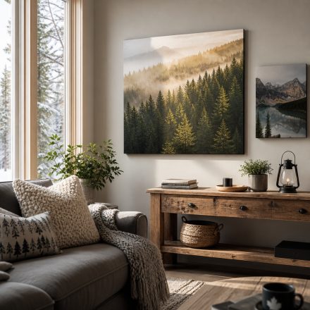
Green: Symbolizes nature, growth, and renewal. Bringing green into your home through canvas prints of lush forests or botanical gardens can create a grounding effect, perfect for living rooms or home offices where you want to feel balanced and focused.
Yellow: Energetic, optimistic, and cheerful. A yellow canvas print can brighten a dark hallway or kitchen, injecting a sense of joy and warmth. However, use it sparingly—too much can be overstimulating.
Red: Passionate, bold, and stimulating. Red accents in a dining room or living area can spark conversation and appetite. A vibrant red canvas print can become a striking focal point that draws the eye and energizes the space.
Neutrals: Whites, greys, and beiges provide a calm backdrop and can make other colours pop. A black-and-white canvas print adds timeless elegance and allows your other decor to shine.
Using Canvas Prints to Evoke Memories Through Colour
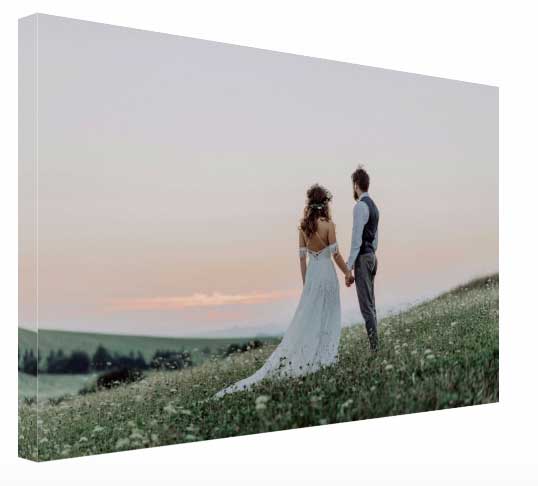
Beyond mood, colour has a unique ability to trigger memories. A canvas print of a sunset over the Prairies, with its warm oranges and pinks, can instantly transport you back to a summer evening with family. Similarly, the cool blues of a Newfoundland iceberg can remind you of a once-in-a-lifetime trip. By choosing canvas prints that feature colours tied to your personal experiences, you create a gallery of memories that not only beautifies your home but also tells your story. At Canvas.ca, we specialize in turning your treasured photos into high-quality canvas prints that preserve those vibrant hues for years to come.
How to Choose the Right Colour Palette for Each Room
When selecting canvas prints, consider the function of each room and the existing colour scheme. Here are some guidelines:
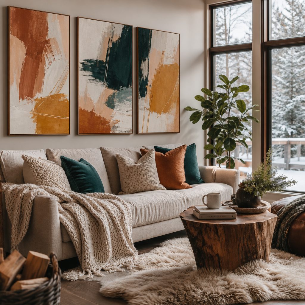
- Living Room: This is where you entertain and relax. Opt for a mix of warm and cool tones to create balance. A large abstract canvas with earthy tones can be both inviting and sophisticated.
- Bedroom: Choose calming colours like blues, greens, or soft neutrals. A serene landscape or a minimalist print can enhance tranquility.
- Kitchen/Dining: Energizing colours like yellow, red, or orange can stimulate appetite and conversation. A vibrant food photograph or a colourful market scene works well.
- Home Office: Focus and creativity are key. Green and blue promote concentration, while a pop of yellow can spark ideas. Consider a canvas print of a motivating quote or a serene nature scene.
Seasonal Colour Shifts with Canvas Prints
One of the joys of canvas prints is their versatility. You can easily swap them out to reflect the changing seasons, much like you would with throw pillows or wreaths. In winter, bring in cool blues and whites to embrace the snowy landscape, or warm reds and golds for a festive feel. In spring, fresh greens and pastels can breathe new life into your space. Summer calls for bright, sunny colours, while autumn invites rich oranges, deep reds, and browns. With Canvas.ca's easy ordering process, you can build a collection of seasonal canvas prints that keep your home feeling fresh and aligned with the time of year.
Tips for Making Colour Psychology Work in Your Space
1. Start with a focal point: Choose one large canvas print that embodies the mood you want, then build your room's palette around it.
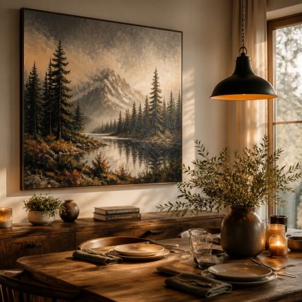
2. Consider lighting: Natural light changes throughout the day and can alter how colours appear. Test your canvas print in different lighting conditions before committing.
3. Balance bold and subtle: If you love a bold colour, balance it with neutral walls and furniture to avoid overwhelming the senses.
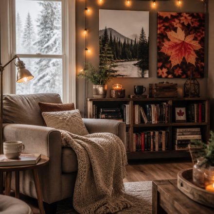
4. Layer textures: Combine canvas prints with textured elements like throws, rugs, and cushions to add depth and interest.
5. Trust your instincts: Ultimately, the colours you choose should resonate with you personally. If a colour makes you feel good, it's the right choice.
Create Your Own Colour Story with Canvas.ca
Ready to transform your home with the power of colour? Canvas.ca makes it easy to turn your favourite photos into stunning canvas prints that reflect your unique style and story. Whether you're looking to evoke calm, energy, or nostalgia, our high-quality prints will bring your vision to life. Visit Canvas.ca today to upload your image, choose your size and finish, and start creating a space that feels authentically you. Your walls—and your mood—will thank you.